10 UI patterns that lift storefront conversion
The components we reach for again and again to turn browsers into buyers, with the why behind each one.
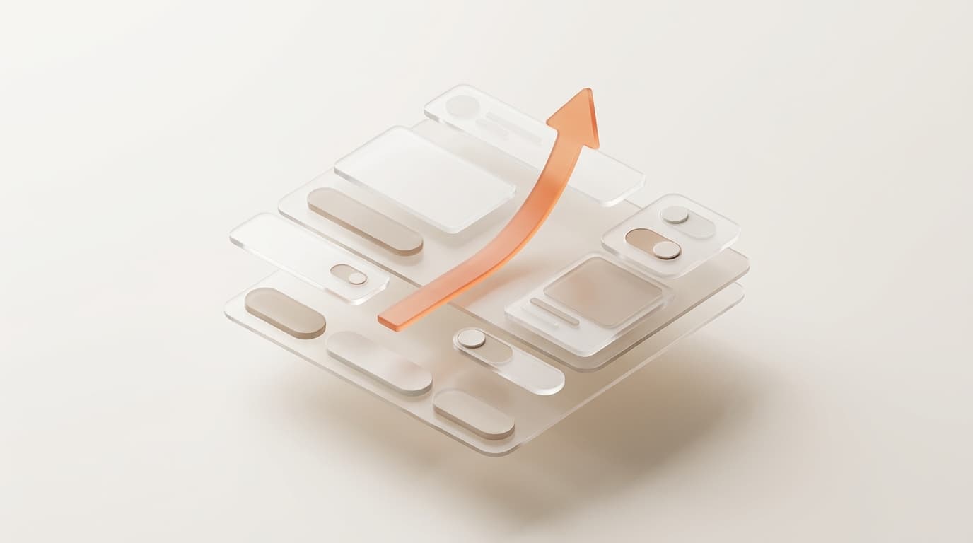
Conversion is rarely won by one hero change. It is won by a stack of small, honest interface decisions that reduce friction and answer the next question a shopper has before they have to ask it. Here are the patterns we reuse on almost every store.
Make the value obvious above the fold
Sticky add to cart, a clear price, and a single primary action beat a crowded hero every time. The shopper should always know the one thing you want them to do next.
- Sticky add to cart on long product pages
- Inline trust badges near the buy button, not buried in the footer
- A persistent cart drawer instead of a full page redirect
- Skeleton loaders so the page never feels broken while it fetches
Reduce decision cost
Variant pickers with real photo swatches outperform plain dropdowns because they remove guesswork. Pair them with honest stock and shipping estimates so the shopper is not surprised at checkout.
Borrow proof from people, not from you
Star ratings near the title, photo reviews on the page, and a small recently bought signal all lower the perceived risk of a first purchase. Social proof works because it answers the quiet question every new buyer has: did this work for someone like me.
Close gently at the end
An express checkout button, a visible returns promise, and a one line guarantee turn a hesitant cart into an order. None of these are tricks. They are just clarity, delivered at the moment it matters.